
ListViews and Filters in Salesforce
If you are familiar with the database operations, and if you have already worked on some of the databases like Oracle and MySql, you might be aware that we can filter the records based on a particular field. ListViews can do the same in Salesforce. It can filter the records, based on a particular field, to which you have access. In more technical terms, if you are looking to segment a specific list of records, then the list view is the perfect tool for that. List View can be executed on multiple records at the same time.
For more effective results, we can create custom list views. More importantly, list views can pull out a smaller subset of data, which can be accessed instantly by different objects. When we create the list views, we define what data will be shown in the columns, and we also specify which fields should be used for filtering the records.
Creating List Views
Before creating a list view, let's discuss a use case. Jhonson has joined a new organization. He has been deputed in the sales team, as a sales trainee. As a new joinee, he is confused completely. On top of that, he has been assigned as the sales representative for a particular company, focuses on the channel sales customer. What Jhonson should do? The solution is simple. Jhonson should create a custom list view, where he can see the specified type of accounts. This will help Jhonson to see what he wants, rather than going through the sea of information stored in the database.
- To create a list view, follow the steps given below.
- Go to the App launcher.
- Then select the sales app, and then select the “Accounts” tab.
- In the next step, go to list view controls and select “New”. Create a custom list, name it as “Selected_Customers”.
- Now select the option, “ All users can see this list view”. Then click on “Save”.
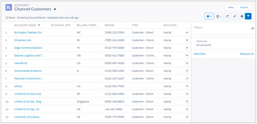
As a result of this activity, the list view will show all the accounts, without any specific criteria like set on them. However, we can see the Filter panel on the right side of the screen.
- Now to get the required set of results, let's apply more filters, and narrow down the result set. Go to the filter panel, and then click on “Add Filter”.
- On the filter dropdown menu, select “Type”.
- Then select “equals” as the operator. Select “Customer-channel” as value. Click on “Done”, and then “Save”.
Now you get a view of the record that is specific as per the given criteria. The criteria are where type equals “Customer-Channel”. Similarly, more customizations can be done by adding more criteria. For example, you can specify channel customers for a particular region.
Customizing a list view
We have already created a list view that shows a selective result, as per the given criteria. We have added the filters as well. You might say that we have already customized the list view. But wait. We can do more. We can even customize the display of the view. We can decide, what we want to see and what we don’t want to see. For example, you don’t want to see some of the fields that are displayed, you can remove it. This is easy. Go to list view controls. Select the option “Select Fields to Display”. Once the dialog box opens up, you can add and remove the fields as per your preference.
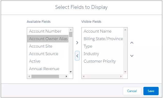
Once you have added or removed the fields, click on “Save”, to save your selection. Once the view is displayed, you will find more refined results, with unwanted columns removed. You can also apply sort by clicking on the arrow beside the fields. List view records are not read-only, so if you want to edit, you can also edit them by click in the records. However, there might be certain fields that might not be editable. You can identify with the lock icon displayed beside them.
List View Chart
You have created a custom recordset with the list view, and the filter panel. But, now you also want to create a chart based on that data for your presentation. So you want to include the overall pipeline value in your presentation, to show the project value of sales. Let us create a ListView Chart.
- Go to the Sales tab.
- Then click on the opportunities tab.
- Then select the all opportunities list view, which is a customized list view with required filters.
- Click on the chart icon, which is just a symbol of a pie chart. The chart panel will open up.
- Click on the configuration icon, and then “New Chart”. Provide a name to the chart, like “Total Pipeline Value”.
- Now set the parameters for the chart. Set chart type as Donut Chart, Aggregate type as Sum, Aggregate field as Amount, Grouping Filed as Account Name.
- Then click on “Save”.
Once you click on the save option, the chart will be created and displayed on the screen. Since the chart is based on a list view that is associated with the object “Opportunity”, the chart itself will be associated with the same object.